Interactive Mobile Raffle
Driving App Activation Through Gamified Conference Engagement
Broker Plus had an existing mobile app, but conference-driven acquisition efforts resulted in low post-install engagement. App downloads were occurring, but meaningful product activation was limited. The opportunity was not just to increase installs — but to move users toward their first meaningful in-app interaction.
My role: I led the design of a gamified mobile raffle that turned conference traffic into a high-impact activation channel — driving 3,000+ new users in three weeks and accelerating time-to-value within the Broker Plus app. I defined the activation flow, partnered with Product and Engineering on incentive logic and feasibility, and crafted an emotionally engaging interaction model to reduce onboarding friction and reinforce engagement.

Problem & Opportunity
The Challenge:
Conference attendees were hesitant to download an app without immediate value.
Traditional onboarding introduced friction that slowed activation.
The app was underutilized as a real-time engagement channel during events.
Why It Matters
For event-based acquisition to be effective, users must experience value immediately — otherwise installs result in short-term spikes without long-term adoption.
Activation at the moment of interest (the conference) was critical to:
Maximize acquisition ROI
Increase app visibility
Reinforce product relevance in real time


UX Strategy & Design Approach
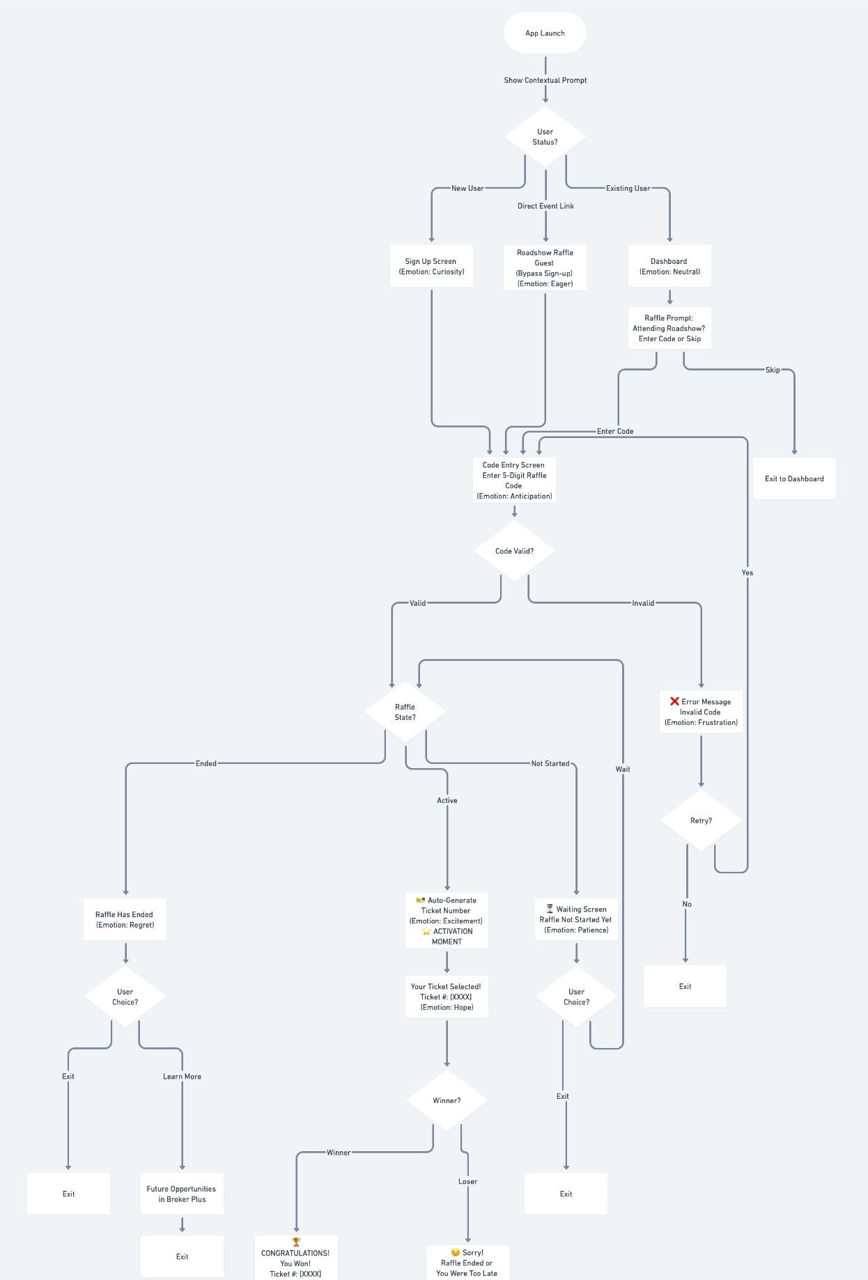
1. Reduce Activation Friction
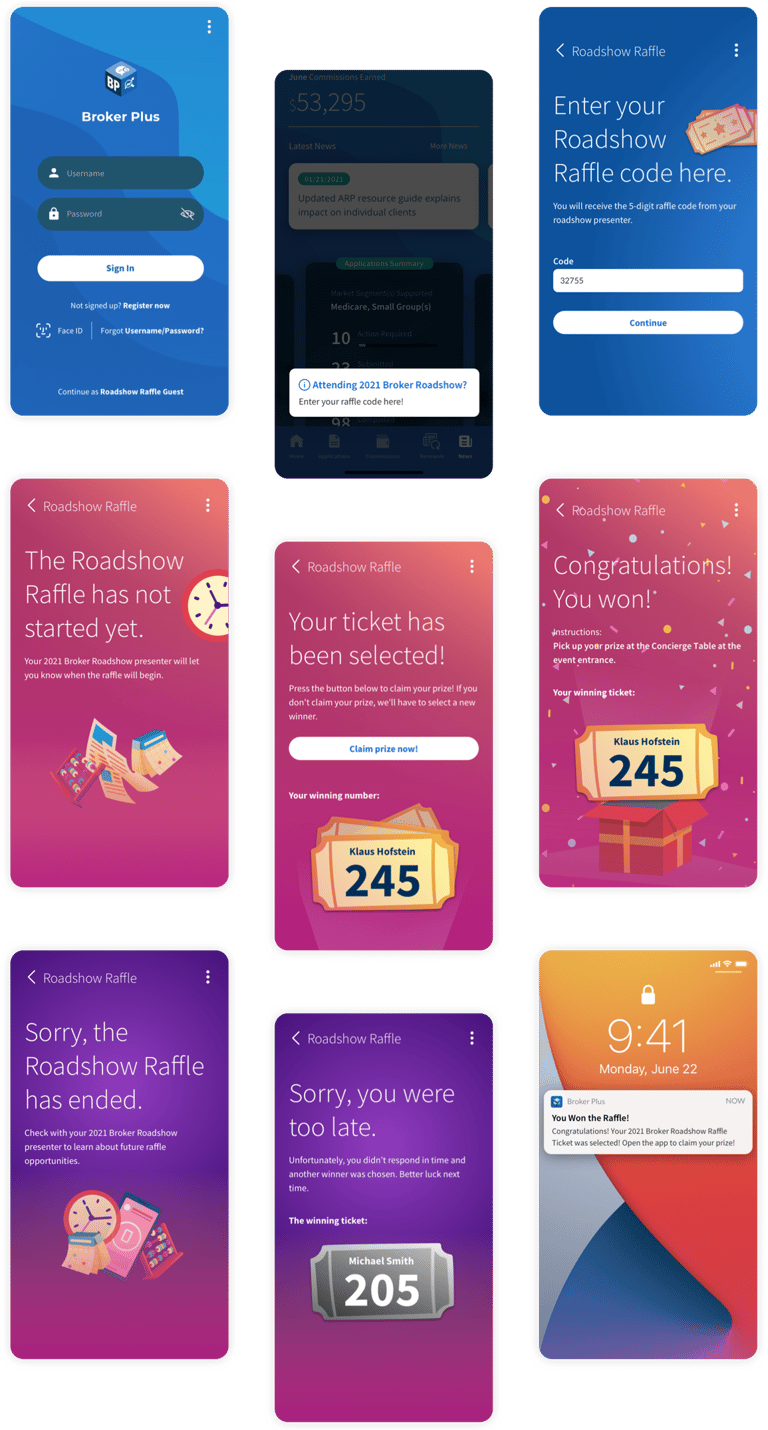
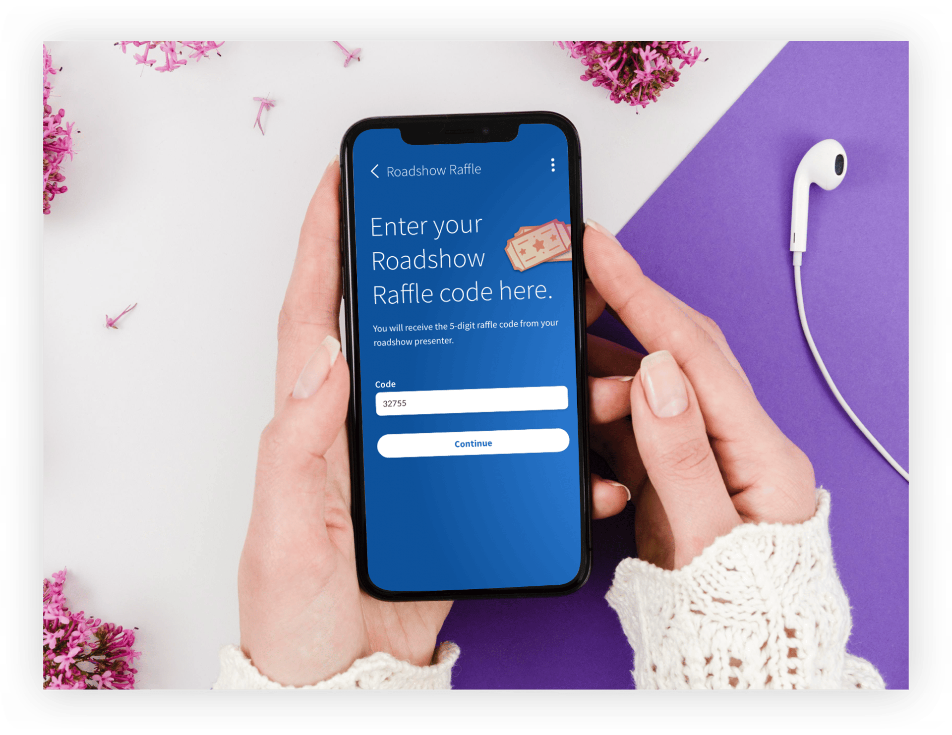
Removed mandatory registration before participation. Users could engage instantly upon install, lowering the psychological barrier to entry.
2. Deliver Instant Value
Designed a “scratch-to-reveal” interaction that provided immediate win/loss feedback, creating emotional reinforcement at the moment of activation.
3. Reinforce Engagement Loops
Integrated push notifications to sustain engagement and encourage repeat interactions during the conference window.
4. Emotional Design System
Developed distinct visual states (idle, reveal, win, loss) with intentional color hierarchy and micro-feedback to amplify delight while maintaining clarity.
Implementation & Collaboration
Partnered with mobile engineers to implement lightweight reveal mechanics optimized for performance.
Aligned with Product on prize logic and notification messaging to ensure business objectives were supported.
Delivered production-ready UI assets and state specifications to enable rapid deployment before the event.


Outcome & Impact
3,000+ new app users within three weeks tied directly to conference engagement.
Significantly increased first-session interaction rates compared to prior event efforts.
Users experienced immediate in-app interaction rather than passive installation, improving early-stage engagement quality.
Voted best Broker mobile app in 2021
Reflections & Learnings
What Worked
Removing upfront barriers dramatically improved activation rates.
Emotional feedback mechanisms strengthened engagement.
Tight collaboration enabled rapid execution aligned with event timing.
Trade-Offs
Lower friction reduced immediate data capture opportunities.
Clearer early alignment on business KPIs would have reduced iteration cycles.


Turning Engagement into Activation
A lightweight mobile raffle designed to accelerate user activation and strengthen product adoption during live events.